Style Guide
Everything you need to design on-brand for Gushwork lives here — the palette, the type scale, the spacing and radius rules, and the components they compose into. When a decision is already made, this guide is where it’s written down, so you can spend your time building instead of guessing.
Concept
We’re enablers of lean exponential growth. Our logo features an exponential curve, a direct reminder & leading indicator of this message. The upward curve transitioning from thick to thin represents our core mission, maximizing ARR per FTE.
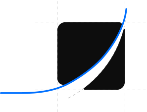
We free businesses from bloated teams at a time where even one-person unicorns can thrive and Gushwork is the gush behind that transformation. Through our on-demand marketing services, we remove subjectivity and productize workflows with humans in the loop, ensuring both quality and quantity. That is faster growth with leaner teams.
This logo serves as a constant reminder of our promise: hockey stick growth and limitless potential for businesses that partner with us.
Logo
The mark is the exponential curve. Keep it consistent — same shape, same proportions — everywhere it appears: web, decks, dashboards, print. Give it clear space, use one of the three approved treatments below, and never redraw or restyle it.

Incorrect usage
The mark carries the brand, so protect it. Don’t recolor it, tilt it, stretch it, or add effects the system doesn’t use. If you’re reaching for a gradient or a shadow, stop.

Correct usage
Pick the treatment by background, not by preference. These cover every surface you’ll build.

Colors
The Brand color palette defines the visual identity, organized into Primary, Neutral, and Feedback color groups with consistent scales from 25 to 900.
- HEX
- #0070FF
- RGB
- 0 112 255
- HSB
- 214° 100% 100%
- CMYK
- 100 45 0 19
- PANTONE
- 285 C
- HEX
- FFFFFF
- RGB
- 255 255 255
- HSB
- 359° 0% 100%
- CMYK
- 0 0 0 0
- PANTONE
- 000 C
- HEX
- #0D0D0D
- RGB
- 13 13 13
- HSB
- 359° 0% 5%
- CMYK
- 0 0 0 95
- PANTONE
- BLACK 6 C
Extended Palette
Every value here is read from foundation/tokens.css, which
is what the plugin builds with — so this panel and the code cannot drift
apart. It mirrors the Figma palette, which leaves
Neutral/35, /250, /500 and
/850 undrawn; those steps exist in the tokens all the
same.
Typography
Typography establishes visual hierarchy, guides the reader’s eye, and sets the tone for the entire design. A well-defined type system ensures consistency across screens, improves readability, and reinforces brand identity at every touchpoint.
AI Agents that Help Businesses Get More Qualified Leads
How to use: Used for titles and section headers, headings establish hierarchy and draw attention to key content. They carry the most visual weight and should be set in a bold or semi-bold weight for clear distinction.
Gushwork’s AI agents help your business get discovered by your buyers, across AI search, Google, and paid channels, then turn that interest into marketing-qualified leads.
How to use: The default style for paragraphs, descriptions, and UI labels. Optimized for readability at smaller sizes with comfortable line height and regular weight to support extended reading.
Spacing & Radius
A consistent spacing scale brings rhythm and structure to layouts, ensuring elements breathe and align predictably across every component.
Consistent corner rounding creates visual harmony across components, softening edges to convey approachability and modern aesthetics. Every step is a multiple of 4 except 2px and 10px.
Elevation
Shadows separate a surface from the one behind it. The ramp is short on purpose — s1 through s4 for stacking, plus two special cases.
Visual elements

The grid is the brand’s visual element, and it runs in three colourways — Flat Black, Primary and Neutral/50. The construction holds everywhere: square cells, a one-pixel line, a few cells filled to break the regularity. The pitch does not: it is set per surface, so the page hero runs 40px cells in Primary/600 while the OG card runs roughly 111px cells whose line carries a radial grey-to-black fade — which is why that one ships as an exported vector rather than CSS. The filled cells carry the meaning: step them diagonally for movement, or stack them into rising columns for growth.
A customer headline that leads with the result and how long it took
Which AI models send visitors to your pages, and how that moves over time.
The shape pairs a plain rounded slab with one whose bottom-right corner sweeps open — that curve is our logo, abstracted. It holds an image, as the case-study card’s does, or a product UI, as an information card’s does, and it works as the block a layout is built from.